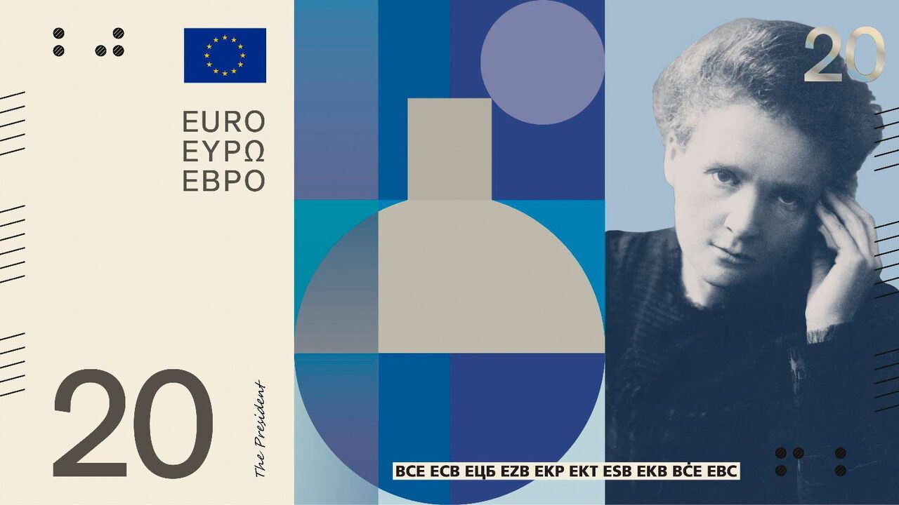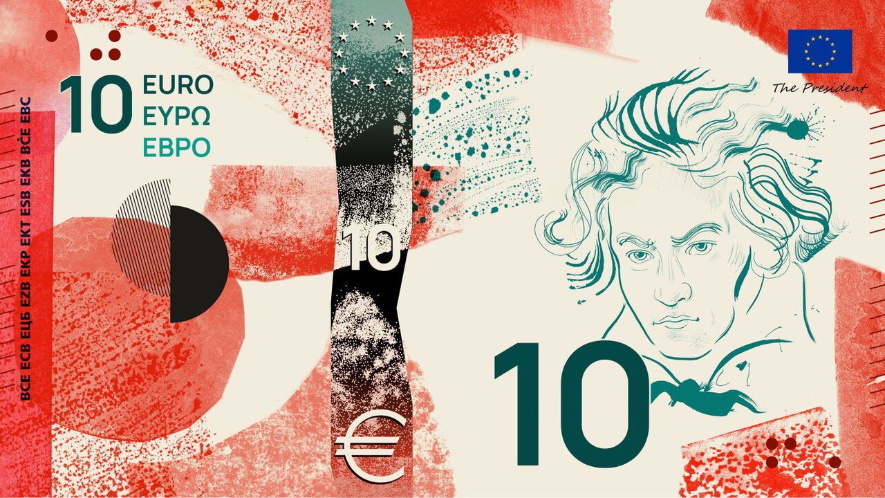
In the eyes of many of its citizens, the European Union is more than a technocratic(技术官僚的) bloc(集团,联盟). Besides Europe’s unity, it symbolises a shared culture and way of life. In the eyes of the euro area’s leaders, an upgrade of its banknotes—used by 21 of the EU’s 27 member states, and more than 20 years old—is a chance to show confidence in the continent.(在欧元区领导人看来,升级纸币是展示对欧洲大陆信心的一次机会。)
在许多欧洲公民眼中,欧盟不仅仅是一个技术官僚集团。除了欧洲的统一,它还象征着共同的文化和生活方式。而在欧元区领导人看来,对其纸币进行升级——这些纸币被欧盟27个成员国中的21国使用,且已流通超过20年——是展示对欧洲大陆信心的一次机会。
The original notes, issued in 2002 and given a facelift(翻新,改版) in 2013, display imaginary bridges, doorways and windows—intended to reflect Europe’s openness and connectedness, but also to avoid rubbing any country up the wrong way. Each denomination(面额,面值) shows a European architectural style, from Romanesque to rococo. But they were a dull, soulless(缺乏灵魂的) choice. The novelty of the euro provided most of the excitement.
最初的纸币于2002年发行,2013年进行过一次改版,上面印有虚构的桥梁、门廊和窗户——旨在反映欧洲的开放与互联,同时也避免冒犯任何国家。每种面额展示一种欧洲建筑风格,从罗马式到洛可可式。但这是一个乏味、缺乏灵魂的选择。欧元的新奇感提供了大部分兴奋点。
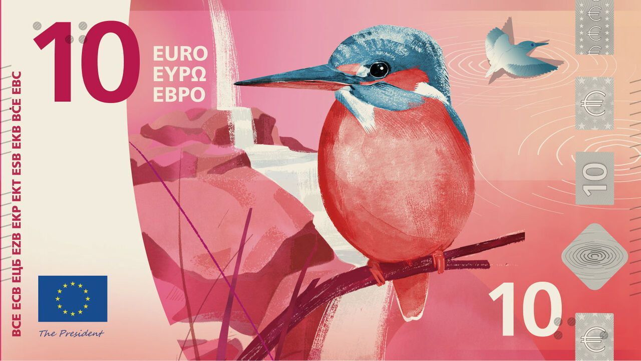
The European Central Bank and its classical-music-loving president, Christine Lagarde, want the new notes to represent more. The bank has narrowed the field to two thematic(主题的) options. The first is to charm users with beautiful birds and rivers on the front of the notes, while hiding buildings hardly anyone will recognise—the EU’s principal edifice(宏伟建筑,大厦)s, including the ECB tower—on the reverse.
欧洲央行及其热爱古典音乐的行长克里斯蒂娜·拉加德希望新纸币能代表更多内涵。央行已将候选方案缩小到两个主题。第一个方案是在纸币正面用美丽的鸟类和河流吸引用户,而在背面隐藏几乎无人能认出的建筑——包括欧洲央行大楼在内的欧盟主要建筑。